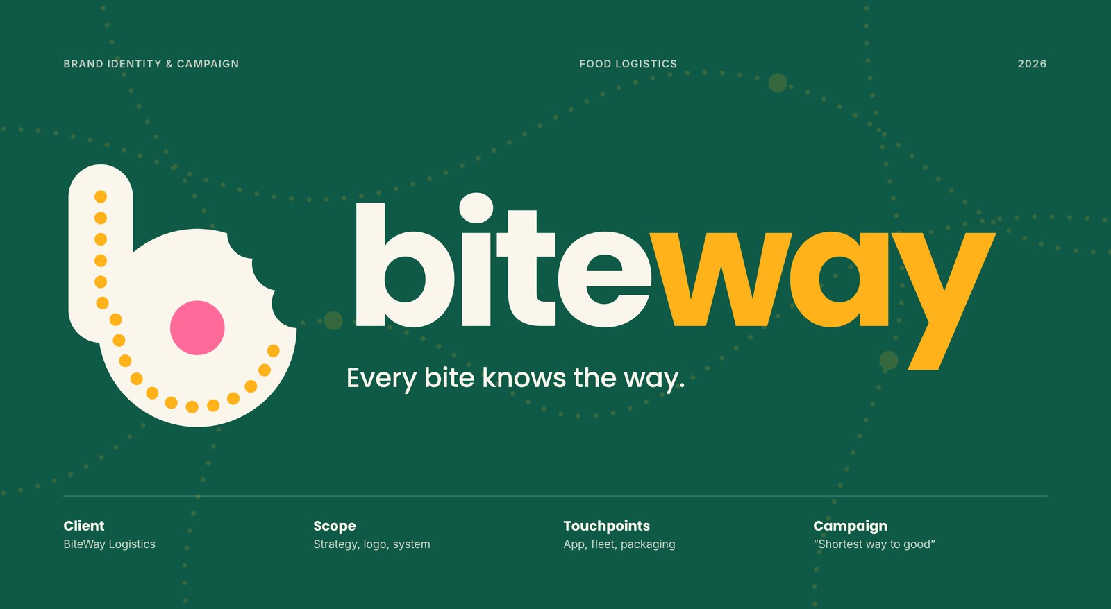
BiteWay is a food delivery and last-mile logistics brand that connects city kitchens, couriers and hungry customers. This project covers the complete brand identity and launch campaign, from the logo and visual system to the app, social media and advertising.
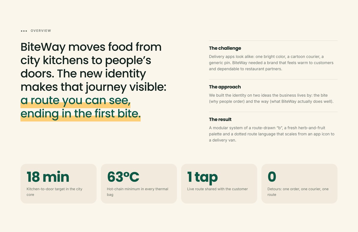
The goal was a delivery brand that does not look like every other delivery app: warm for customers, dependable for restaurant partners, and built around what the business actually does.
The goal was a delivery brand that does not look like every other delivery app: warm for customers, dependable for restaurant partners, and built around what the business actually does.
THE CONCEPT
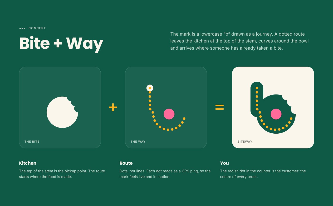
The identity is built on two words: Bite, the reason people order, and Way, the thing BiteWay does best.
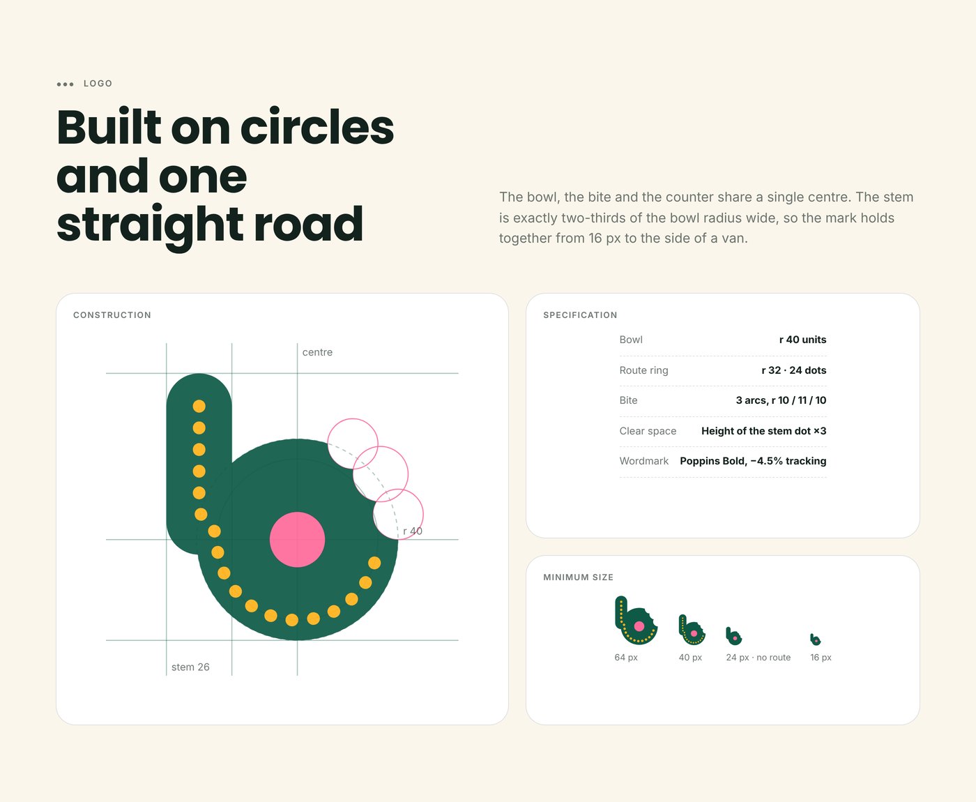
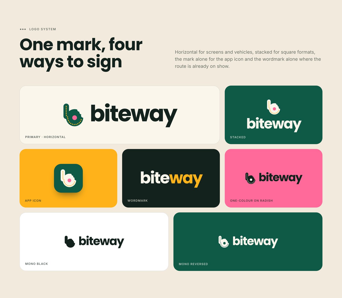
The logo is a lowercase “b” drawn as a journey. A dotted route leaves the kitchen at the top of the stem, curves around the bowl and arrives where someone has already taken a bite. The radish dot in the centre is the customer.
COLOUR & TYPOGRAPHY
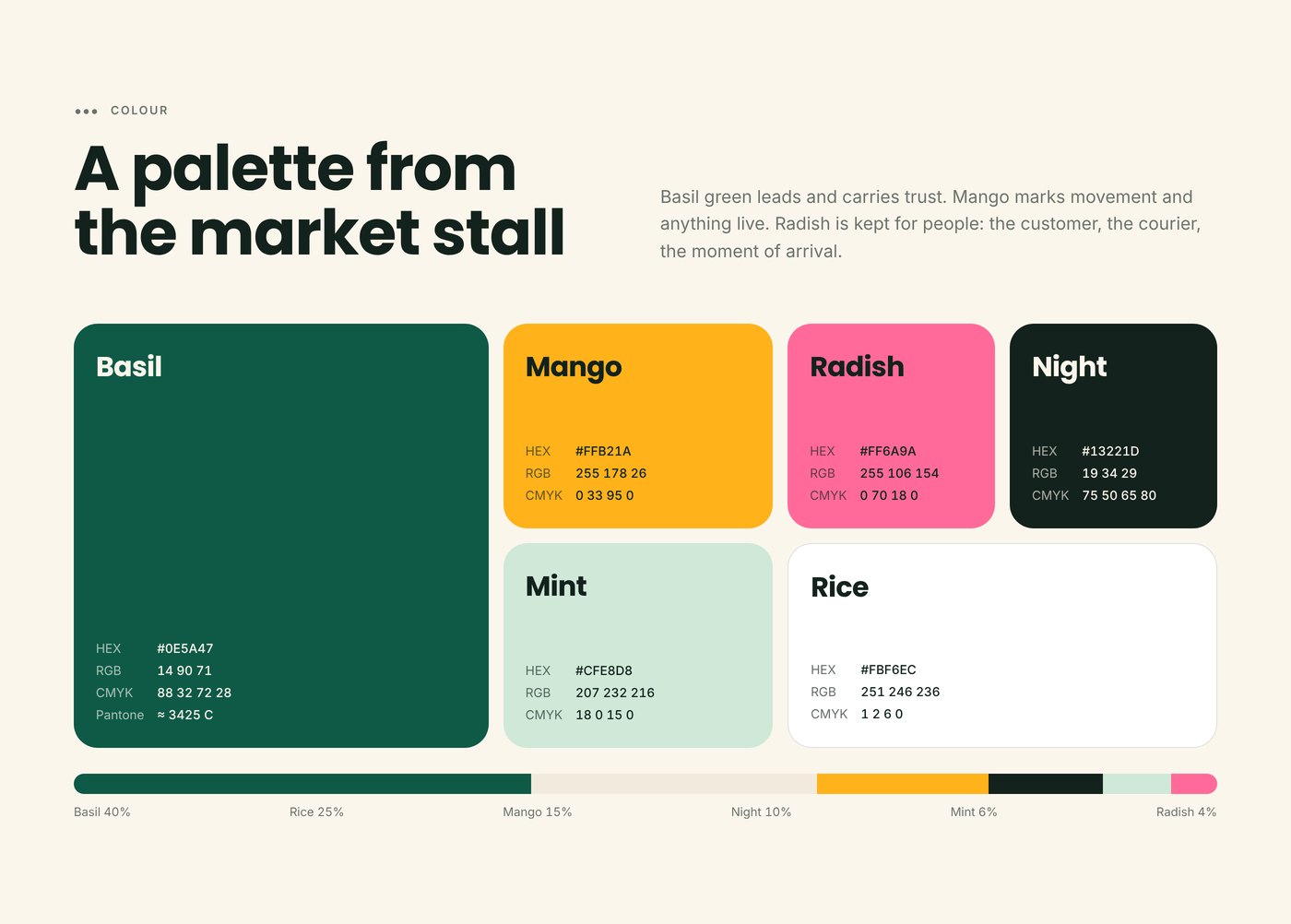
A palette taken from the market stall: Basil green for trust, Mango for movement and anything live, and Radish pink reserved for people — the customer, the courier and the moment of arrival.
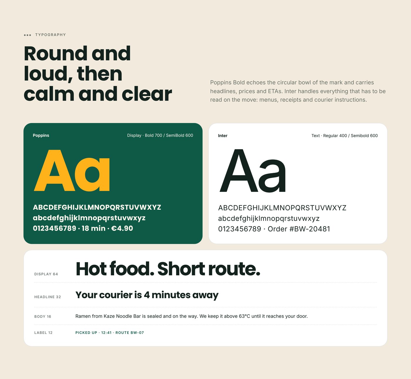
Poppins Bold echoes the round bowl of the mark for headlines, prices and ETAs, while Inter keeps menus, receipts and courier instructions easy to read on the move.
APPLICATIONS
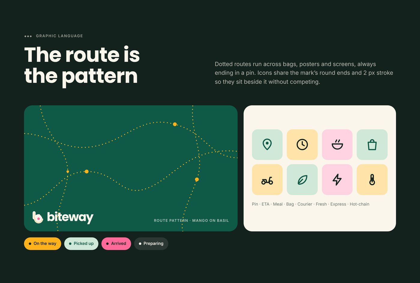
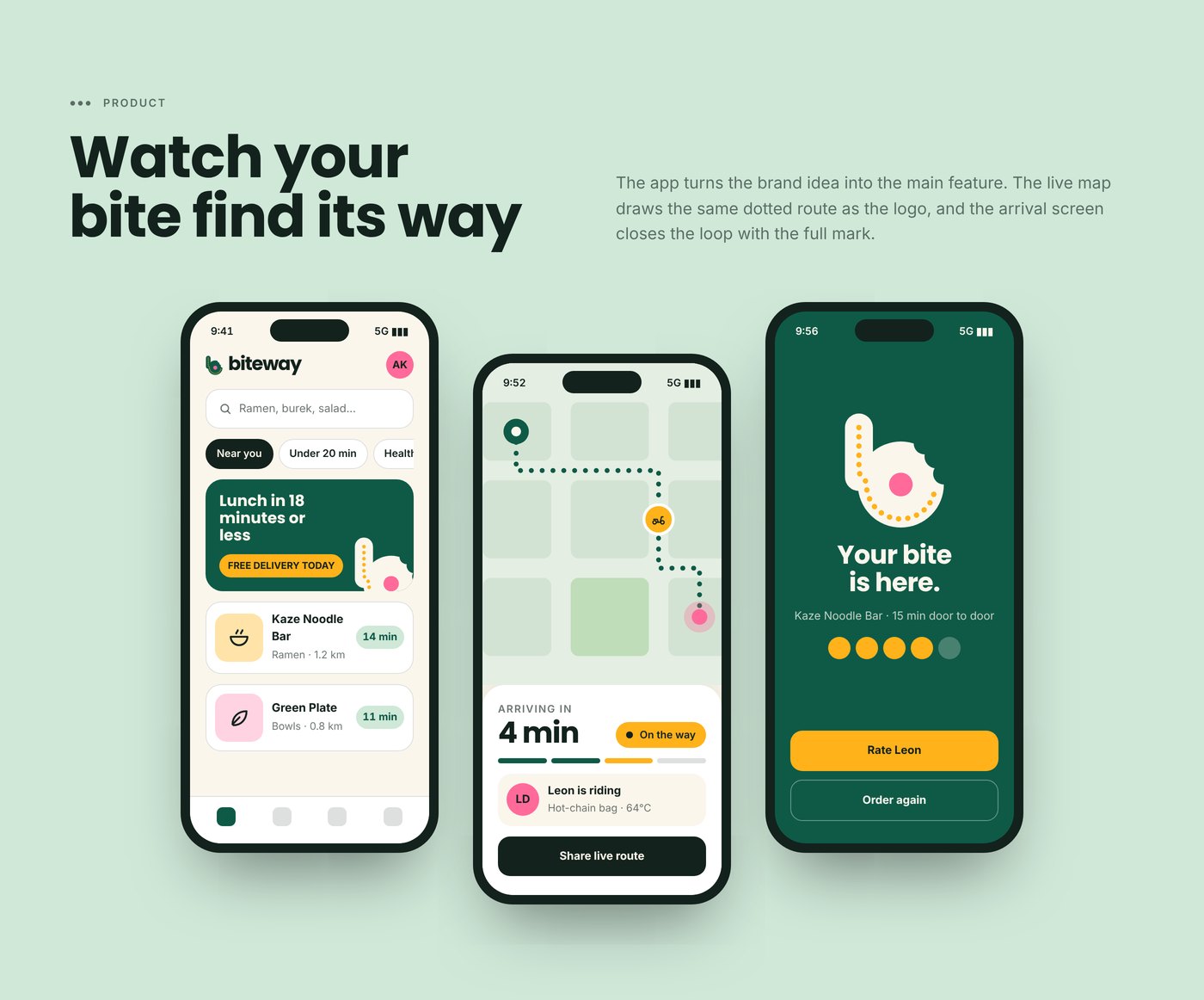
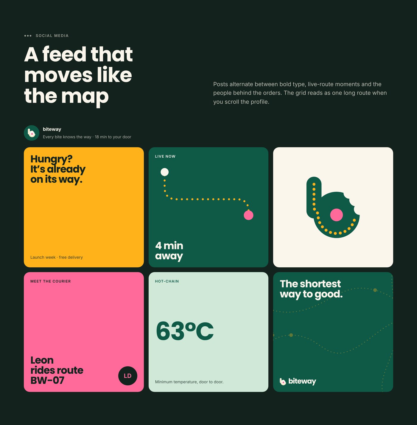
The dotted route becomes the main graphic language across every touchpoint. In the app, the live map draws the same route as the logo, and the arrival screen closes the loop with the full mark.
Status pills, icons and live ETAs all share the same round shapes and colours, so every screen feels like part of the same journey.
LAUNCH CAMPAIGN
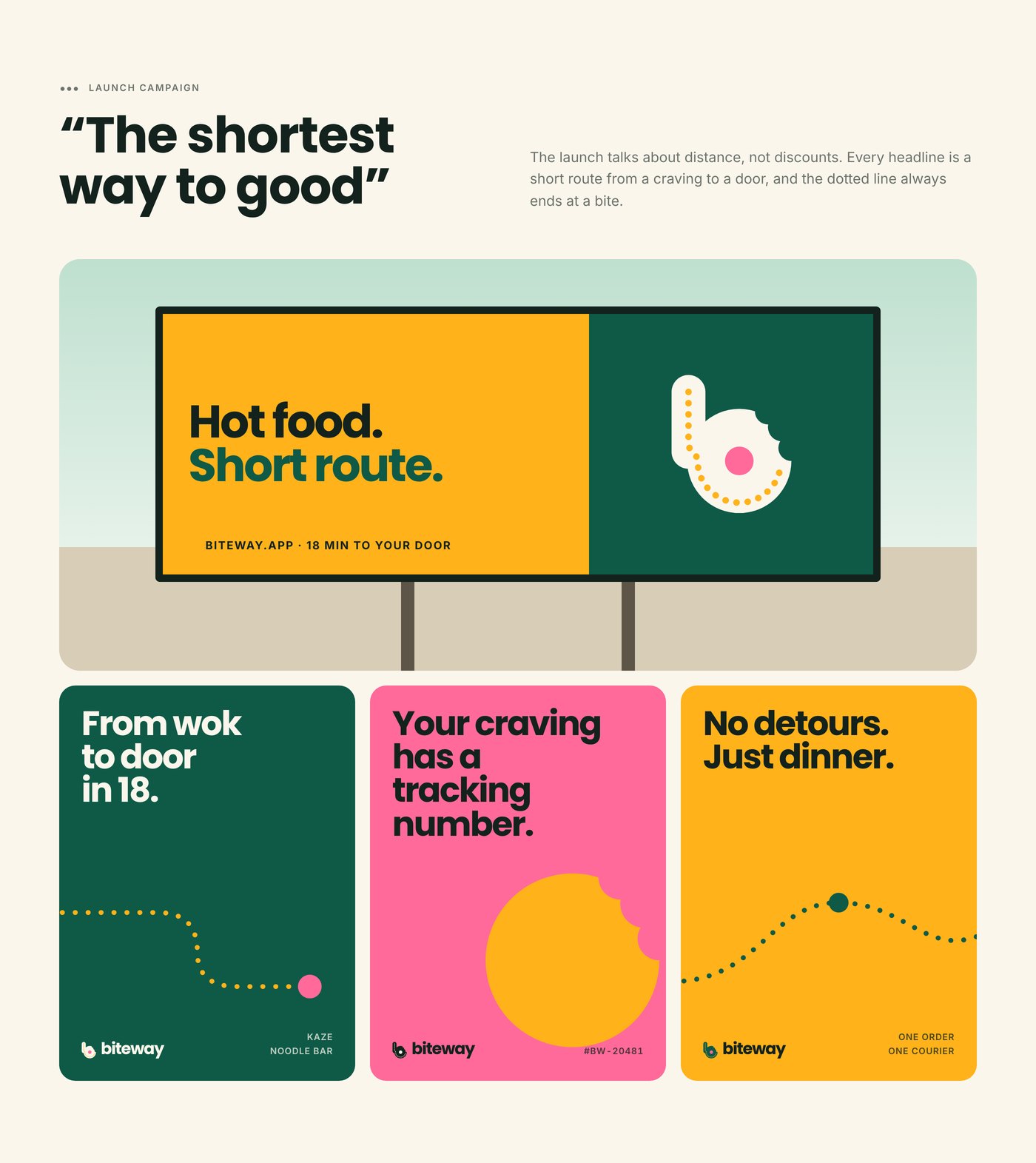
“The shortest way to good” talks about distance, not discounts. Every headline is a short route from a craving to a door, and the dotted line always ends at a bite.
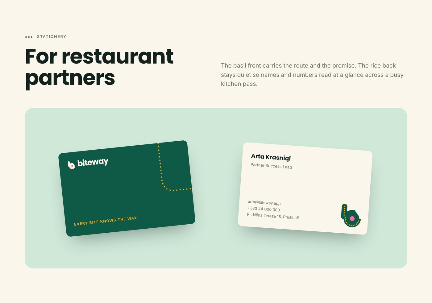
The campaign runs across billboards, posters, social media and partner stationery.
MY ROLE
• Brand Strategy & Concept
• Logo & Visual Identity Design
• Campaign & Advertising Design
• UI & Digital Applications
• Logo & Visual Identity Design
• Campaign & Advertising Design
• UI & Digital Applications
Responsible for the complete brand system — from the first concept and logo construction to the colour palette, typography, applications and launch campaign.